Modeling the Rise of Carbon Dioxide
Made in 2019 with GSAP, React, and a ton of JavaScript
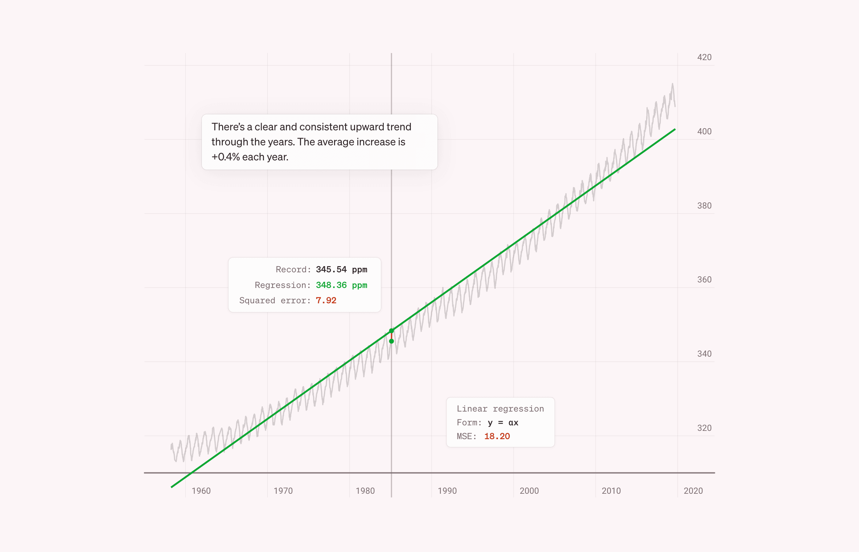
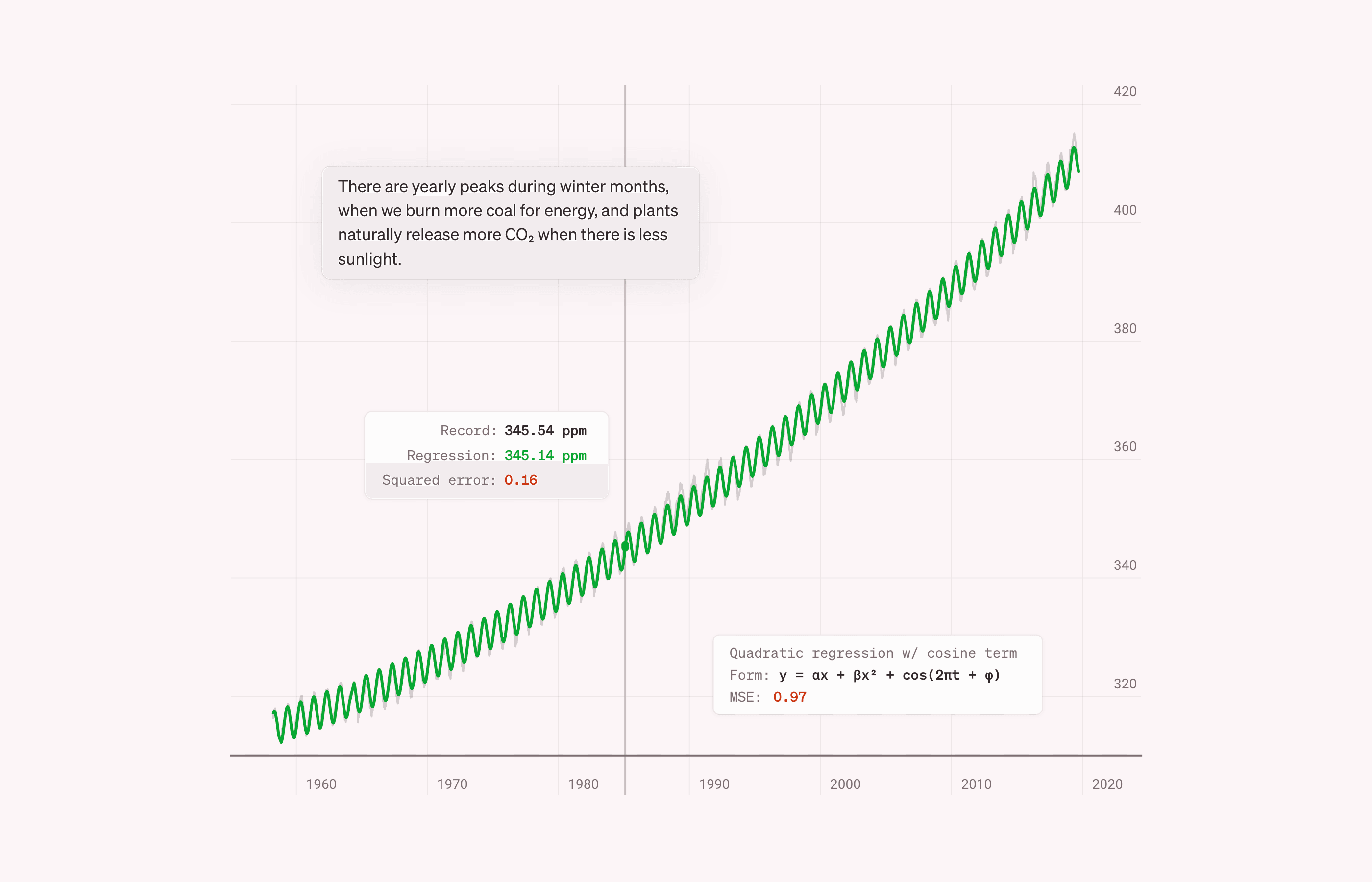
Recent trends in atmospheric carbon dioxide are brought to life using interactive data visualizations and scroll-based animations.
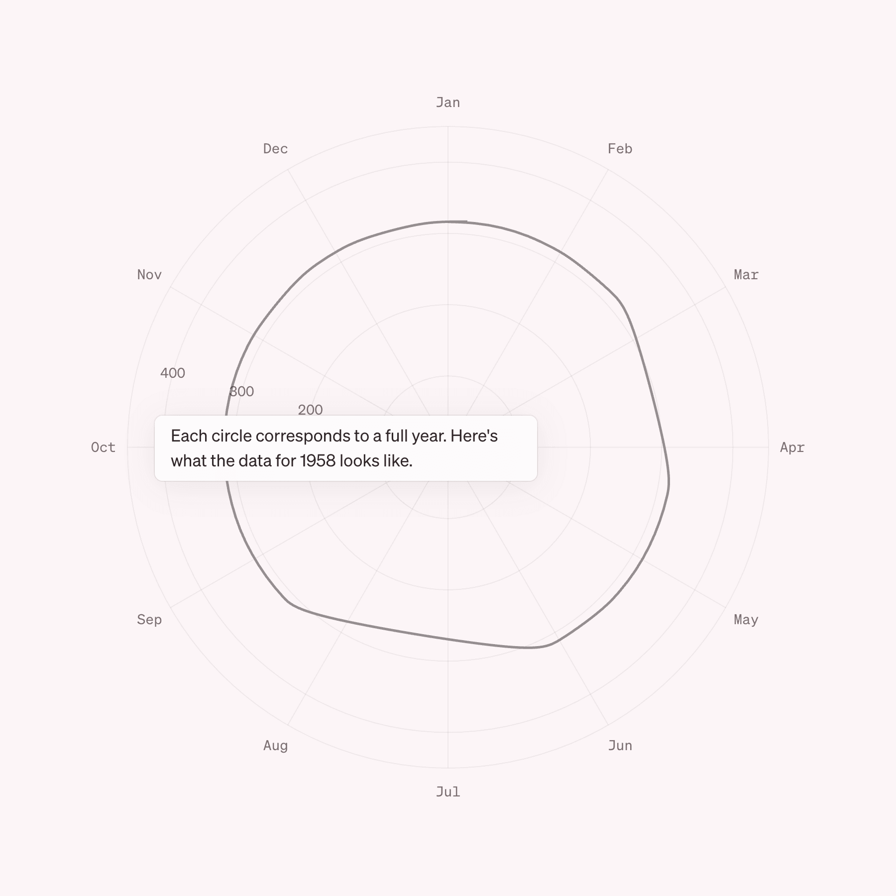
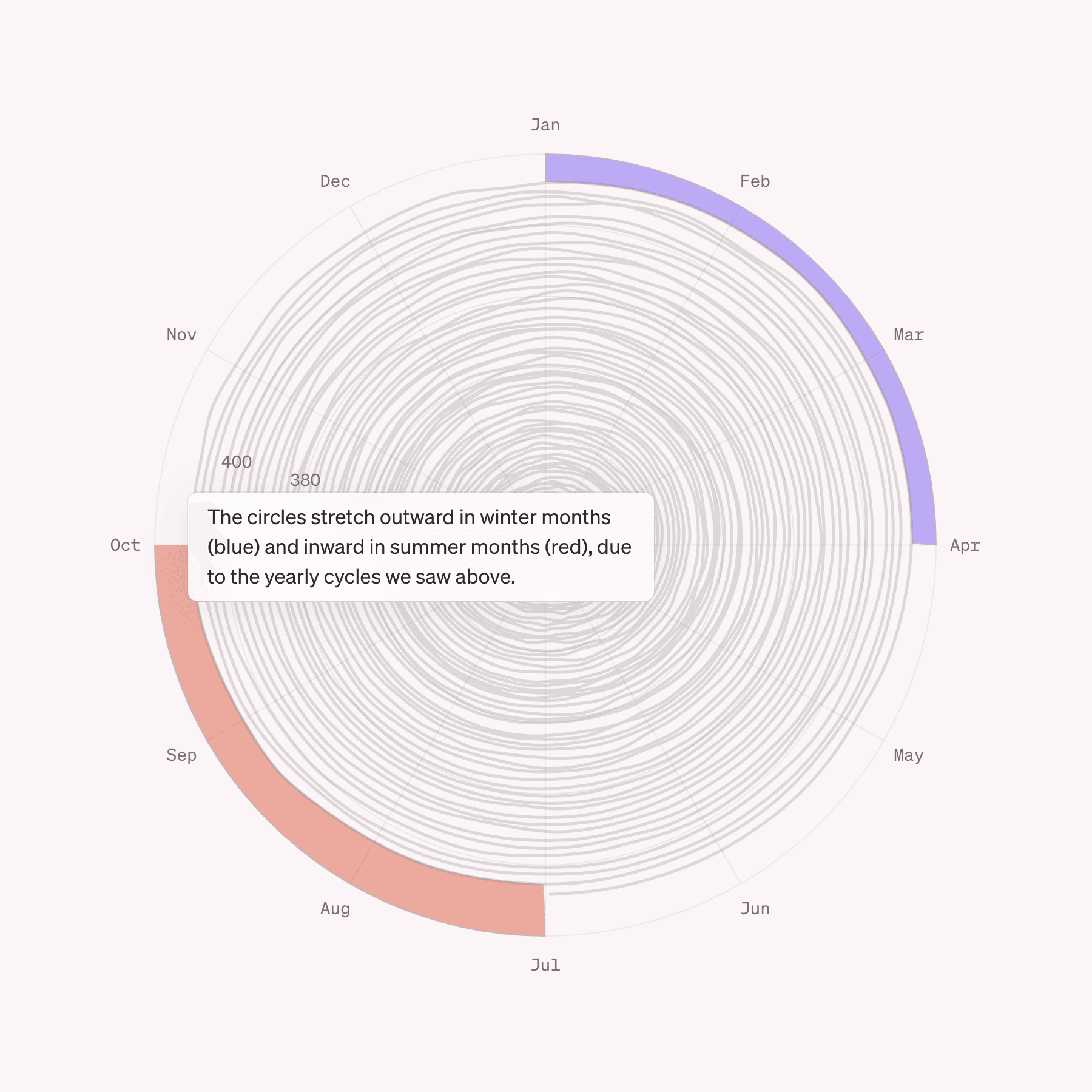
In addition to a line chart, the same data is presented in a polar plot where seasonal variations fade into the background as year-by-year changes are highlighted.


